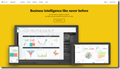
Microsoft Power BI is a tool for users to create visualizations of data from disparate sources. You can get started with the browser-based version of Power BI by navigating to https://powerbi.com/. This page is shown in Fig. 1.
If your company has an Office 365 account, you may be able to sign in by clicking the [Sign in] button and start using Power BI. If not, you can click the [START FREE] button to create a free account.
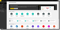
Once you are signed in, the Home page displays, as shown in Fig. 2.
You can add data to Power BI to begin working with it by clicking the [Get Data] button (Fig. 3)
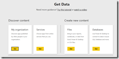
The "Get Data" page displays, as shown in Fig. 4.
From this page, you can choose to import data published by your organization ("My organization"), from a third-party service ("Services"), from a file on your computer or network ("Files") or from data in a database ("Databases").
Click the [Get] button on the "Files" blade (Fig. 5) to display the "Files" page, as shown in Fig. 6.
As you can see, you can import data from your local file system, from OneDrive, or from a SharePoint site.
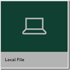
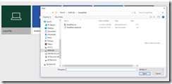
Click the "Local File" blade (Fig. 7) to open a File Open dialog, as shown in Fig. 8.
Navigate to the folder containing your data file, select the file, and click the [Open] button.
A list of all files imported is displayed, as shown in Fig. 9.
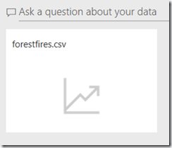
Click on your data file name to display the "Ask a question about your data" blade (Fig. 10); then, click the file name in this blade.
A blank canvas displays, along with a side menu and a list of fields in your data, as shown in Fig. 11.
Select the checkboxes next to some of the fields to create the first visualization on the canvas. In the example in Fig. 12, I selected "nMonths", which holds a number from 1-12, representing the month (Jan-Dec) that a measurement was taken. This is set as the x value. I also selected, "temp", which contains the measured temperature. This created the bar chart visualization at the left of the canvas.
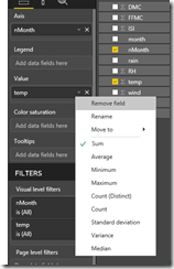
If you click on "temp" under "Value", you will notice that it shows the Sum of the temperatures, which is not very useful information. You can select something more useful, like "Average", "Minimum", or "Maximum" temperature from this menu, as shown in Fig. 13.
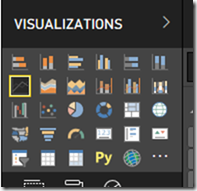
If you don't like a bar chart, you can also change the type of visualization by selecting something different from the "VISUALIZATIONS" blade, as shown in Fig. 14.
This quick overview shows some of the features available in Microsoft Power BI.
