The tag has been around a long time and supports a number of values for the “type” attribute (“text”, “checkbox”, “hidden”, etc.) HTML5 adds a number of new allowed values to the input type attribute. These are designed to capture specific types of input data. Allowed values are
- color
- date
- datetime
- datetime-local
- month
- number
- range
- search
- tel
- time
- url
- week
For example, if you want the user to enter a color value, use the following markup:
<input type="color" name="MyColor">
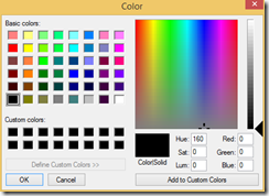
In Chrome, this markup renders a button that, when clicked, displays the following popup, allowing users to select the color of their choice.
Some browsers render different controls for these input types. For example, Chrome renders a popup calendar for the date type and a color picker for the color type. Browsers that don’t support custom controls simply render a textbox.
Even if no special control is rendered, the behavior of these objects is affected by the type value. Two properties – valid and invalid – were added to input tags in HTML5 and these property values change depending on the input type value and the data entered by the user. For example, if a user attempts to enter text into a control, the valid property will be set to false and the invalid property will be set to true. You can access this property either through JavaScript or through CSS, which is a good way to provide visual cues that a user has not correctly completed a form.
The new Input types are a great way to make it easier for users to input data into your forms; to restrict user input based on the expected data use; and to validate form input.
