January 2014 Gratitudes

Comments [0]

2/2
Today I am grateful to those who went out of their way to connect with me personally while I was in Seattle last week.

2/1
Today I am grateful for a week at TechReady filling my brain and my belly.

1/31
Today I am grateful I was invited to a private party at a frickin' pro football stadium!

1/30
Today I am grateful for a seafood dinner in Seattle last night with my teammates, that I met this week.

1/29
Today I am grateful to the honest person who found and returned my laptop yesterday.

1/28
Today I am grateful for the opportunity to learn so much.

1/27
Today I am grateful for the hospitality and generosity of my friend Ted Neward and his family.

1/26
Today I am grateful for a good night sleep after a long day of travel.

1/25
Today I am grateful that my team is patient and willing to answer all my dumb questions.

1/24
Today I am grateful that so many universities are willing to allow me to come in and teach their students.

1/23
Today I am grateful I was able to stay inside yesterday and avoid the extreme cold.

1/22
Today I am grateful for lunch yesterday with my friend Dan, who I don't see often enough.

1/21
Today I am grateful that the folks at Indiana University were able to organize a game development event on short notice and that people attended on a day the University is closed.

1/20
Today I am grateful that my job takes me to Bloomington, IN, so I get to spend bonus time with Tim Giard.

1/19
Today I am grateful for a successful game development hackathon at Rose-Hulman yesterday in Terrre Haute, IN.

1/18
In 2012, I bought a new car. Although it's not fancy, I am grateful today that it has navigated safely through the many miles of bad weather and rough road conditions I've driven these past 2 weeks.

1/17
Today I am grateful I was upgraded to a 2-bedroom suite last night.

1/16
Today I am grateful that I've found a job I love.

1/15
Today I am grateful to start another year of the Great Lakes Area .NET User Group. #MIGANG

1/14
Today I am grateful to all the amazing people who appeared on #TechnologyAndFriends, helping me to make it to show 300.

1/13
Today I am grateful I could spend yesterday walking around downtown Chicago with my son.

1/12
Today I am grateful for an amazing day yesterday - watching a Spartan overtime victory with my goddaughter Amanda and my son Tim; followed by the Microsoft mid-winter party at the Chicago Field Museum.

1/11
Today I am grateful that no damage was done to my house while I was out of town 4 days during a severe cold, snow, and rain.

1/10
Today I am grateful to Jim Holmes and the amazing job he and his minions have done producing the #CodeMash conference the past 8 years!

1/9
Today I am grateful that 2 full days of precompiler workshops at #CodeMash are now behind me.

1/8
Today I am grateful to reconnect with so many old friends this week at #CodeMash

1/7
Today I am grateful we made it safely driving 130 miles in arctic conditions last night.

1/6
Today I am grateful for the young men who helped push my car out of a snow bank last night.

1/4
Today I am grateful for lunch yesterday with my son, who took me to his favourite cheesesteak restaurant.

1/3
Today I am grateful for my Aunt Ida, who passed away earlier this week. After 90+ years being kind to others, she has gone to heaven to be with her husband. RIP Aunt Ida.

1/2
Today I am grateful for the Michigan State Spartan football team and their exciting Rose Bowl victory over an excellent Stanford Cardinal team. #GoGreen

1/1
Today I am grateful for an amazing 2013. I grew more these past 12 months than I have in many years.

12/31
Today I am grateful I was able to keep down my breakfast. I'm feeling much better than I did yesterday.

12/30
Today I am grateful my son Nick was able to make it home for Christmas.


TechReady Recap

Comments [0]

TechReady is an internal conference for Microsoft field employees. As far as I can tell, field employees are those who do not work for a product team in Redmond, which is still a lot of people.

Well, I am now a Microsoft employee and my group (Developer Platform Evangelism, aka DPE) does not build products, so I was able to attend TechReady for the first time this week.

What an experience! I attend a lot of conferences and my habit at these conferences is to only attend a few sessions, electing instead to find smart people in the hallways or speaker room or lunch room and pick their brains to learn as much as I can about real world software experiences. This conference was different - in part because I didn't know a lot of attendees and in part because so much of the content was not available anywhere else.  I attended as many sessions as I could and even watched recordings of a few sessions on the flight home.

Before attending, I promised I would not share the content of any sessions (much of it focused on features that may or may not be in a future product release); so I'll share my impressions and experiences here.

First, this conference was a great opportunity to meet others inside Microsoft. A number of evangelists from the west region attended and I got to know them. One night, my team had dinner with Sanket Akerkar, the Vice President in charge of US DPE. I was impressed with his openness and the frank exchange about the future of evangelism within Microsoft.

At most meals, I sat with strangers and got to know people from all over the world in many different roles at Microsoft. Microsoft is a very diverse company with all kinds of people doing all kinds of things and this week really underscored that fact to me. I also had a chance to meet up with some old friends, such as Josh Holmes, Kevin Pilch-Bisson, Dani Diaz, Chet Kloss, Mark Grimes, Jeff Wilcox, and Ted Neward. Ted doesn't work for Microsoft but he invited me to dinner with his family when he heard I was in town. I had a long conversation with consultant David Chappell, a Microsoft consulting partner who has written extensively on the impact of the cloud on businesses. Part of that conversation was recorded and I'll share it in a few weeks.

I heard a lot of talk about technologies that I want to explore later - in particular Project Siena and Unity.

I listened to many people smarter than me discussing product feature decisions. I was impressed by how much of Microsoft product features are driven by customer requests. A frequent exchange I heard was: "Why did you decide to implement Feature A and not Feature B?" "Because many of our customers have requested Feature A and we hear very little demand for Feature B, so we deferred B for a later release." Microsoft is sometimes perceived as a walled tower that unilaterally pushes products on customers but this week showed me emphatically that is not the case.

Overall TechReady gave me a greater appreciation for my new company. The conference is bi-annual, so I hope to get back to it shortly.


Introduction to jQuery

Comments [0]

Ajax refers to the pattern of calling server-side methods from client-side JavaScript. jQuery provides a simple, straightforward method for making Ajax calls. The syntax is

$.ajax({
            url: ServiceEndpoint,
            dataType: ReturnDataType,
            type: HttpVerb,
            data: Data,
            error: function (err) {
                // Code to run when error returned
            },
            success: function (data) {
                // Code to run when successfully returned
            }
          });

where

  • ServiceEndpoint is the URL of the method to call on the server
  • ReturnDataType is the data format we expect the server method to return (“xml”, “html”, “script”, “json”, “jsonp”, or “text”). You can specify multiple values and the server will return the first matching format type that is supported by this method.
  • HttpVerb is the HTTP verb (“GET”, “POST”, “PUT”, or “DELETE”) to use to send data to the server.
  • Data is the data (if any) that is sent from the client to the server.

By default the Ajax method executes asynchronously. When a call returns from the server, jQuery will run the function specified in the success parameter (if the call returned successfully); or the function in the error parameter if an exception occurred. These functions accept return data or error information returned from the server as parameters, so that your client-side code can handle return values effectively.

Ajax can provide a much more responsive experience to your web page and jQuery can make ease the process of making Ajax calls.


In the last article, I showed how to use jQuery to select elements in the Document Object Model (DOM) of a web page. In this article, I will show things you can do with those selections.

Calling Methods on Selections

We can call methods on the list of objects returned by a selection simply by appending a dot, followed by the method call and any arguments to the selection syntax. For example, the following jQuery will hide all the anchor tags on a page:

$(“a”).hide();

Binding Functions to Selections

One of the powers of jQuery is the ease with which we can bind a function to the events of an object, so that this function executes whenever the event fires. To do so, simply append a selection with a dot followed by the name of the event; then, pass the function as an argument to the event, as shown below:

$(selection).eventname(function(){
…
}

For example, the click event fires when a user clicks on a page element. The following sample binds a function to the click event of an element with the ID “Div1”:

$(“#Div1”).click(function(){
…
}

The (document).ready event

The document variable is defined within the jQuery script. Selecting this variable with $(document) will return the document as a whole. The most common use for this selector is to bind a function to the document’s ready event. The syntax for this is

$(document).ready(function(){
    …
});

I have omitted the body of the function in this case, but notice the anonymous function declaration. In JavaScript, we don’t need to assign a name to a function if we are binding it to an event – we only need to pass that function to the method name. This is common syntax in JavaScript.

In fact, binding a function to the document ready event is so common, that its syntax can be shortened to simply surrounding a function with parentheses preceded by “$”, as shown in the following snippet, which does the same thing as the previous snippet

$(function(){
    …
});

Putting it All Together

We can nest functions in jQuery and we often do so by binding code to events when the document.ready event fires, as in the following example:
<script type="text/javascript" src="jquery-1.10.2.min.js">script>
 

Once you have a reference to the canvas’s context (the ctx variable, in the example above), you can use this cccccontext to draw shapes on the canvas.

  • beginPath(): Resets the current path. Necessary if you have been using the context object to draw something and now want to begin drawing something new.
    moveTo(): Move the current postion to a given x,y position in order to begin drawing from there
    lineTo(): Draw a line from the current position to a new position
    fill(): Complete a 2-dimensional shape (if not already complete) and fill it in with the current fill color and style
    fillRect(): Draw a rectangle and fill it with color
    arc()    Draw a curve

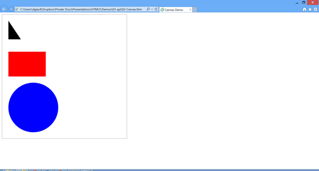
Below are several examples of using JavaScript drawing and filling simple shapes on a canvas with the id of “MyCanvas”.

JavaScript to draw a triangle on a canvas

var canvas = document.getElementById("MyCanvas");
ctx = canvas.getContext("2d");
ctx.beginPath();
ctx.moveTo(25, 25);
ctx.lineTo(75, 100);
ctx.lineTo(25, 100);
ctx.fill(); 

JavaScript to Draw and fill a rectangle on a canvas

var canvas = document.getElementById("MyCanvas");
ctx = canvas.getContext("2d");
ctx.beginPath();
ctx.fillStyle = "rgb(500,0,0)"; 
ctx.fillRect(25, 150, 150, 100); 

JavaScript to Draw a circle on a canvas

var canvas = document.getElementById("MyCanvas");
ctx = canvas.getContext("2d");
ctx.beginPath();
ctx.arc(125,375,100,0,2*Math.PI, false);
ctx.fillStyle = "Blue";
ctx.fill(); 

Here are the results of the JavaScript above:

image

“DATA DASH” ATTRIBUTES

In the past, HTML defined a finite list of tags and attributes that it considered valid markup. This changes with HTML5. Now, any attribute that begins with “data-” (pronounced “datadash”) is considered valid markup. In fact, such attributes have a super power, in that you can access them in JavaScript, via the object’s data collection.

For example, if I have the following markup in my page:

<div data-firstname="David" data-lastname="Giard" id="fName"> 

, I can access the data stored with the datadash attributes via the following JavaScript:

var div = getElementById("fName");
var fn = div.data("firstname");
var ln = div.data("lastname"); 

WEB STORAGE

Web storage is a feature of HTML5 that allows you to write JavaScript to store data on the client. This is useful if you want to maintain state as the user navigates from page to page or if they close the browser and return to your site at a later time.

There are two types of web storage – Local Storage and Session Storage. The difference between these two is that session storage is reset after the user closes the browser, while local storage persists between sessions.

The syntax of the two web storage types is very similar. The window object contains 2 properties – localStorage and sessionStorage to access local storage and session storage respectively. You can store data in these by assigning creating a property and assigning a value to it, as in the following JavaScript example:

var lStorage = window.localStorage;
lStorage.lastProductViewed = “Widget”;
var sStorage = window.sessionStorage;
sStorage.currentProduct = “Widget2”;
var product = lStorage.lastProductViewed; 

GEOLOCATION

Geolocation is a feature that allows the browser to determine the physical location of the user. Before describing the API, it is important to understand some limitations of Geolocation.

In order to use the geolocation API, the user must turn on location tracking in their browser. When a script first make a call to the geolocation API, the browser may prompt the user for permission to turn on this feature. 

Location is determined by one or more of the following methods: IP address tracking; GPS; Wi-Fi; Cell Phone Tower triangulation; and user-defined settings. Not all these features may be available and the accuracy and precision may vary from one feature to the next, or even from one day to the next.

The API is relatively straightforward: The navigator.geolocation exposes the getCurrentPosition method, which returns a position object. The only trick is that this method runs asynchronously, so you must pass to getCurrentPosition the name of a function to call when the method returns successfully. This function will accept the return value (a position object) as a parameter. The position object contains properties, such as

You may also pass to getcurrentPosition the name of a function to call if an error occurs.

A sample JavaScript syntax is below:

navigator.geolocation.getCurrentPosition(showPosition, showError);
var coords = position.coords;
var lat = coords.latitude;
var lng = coords.longitude;
position.coords contains a number of useful properties, including latitude, longitude, accuracy, altitude, altitudeAccuracy, heading (direction of movement), and speed. 

CONCLUSION

In this article, I described some of the new JavaScript APIs introduced with HTML5.

In this series, I introduced some of the concepts and features of HTML5 and CSS3.


HTML5, Part 6 - More CSS3

Comments [0]

In my last article in this series, I covered a few of the new features introduced with CSS3. This article introduces some more new CSS features.

A WORD ABOUT COMPATIBILITY

Most browser vendors began working on CSS3 features before they became full recommendations by the W3C. As a result, some implementations are specific to certain browsers. To accommodate these, it is sometimes necessary to precede a style name with a vendor prefix, as in the following example:

#title {
    transform:rotate(-15deg);
    -ms-transform:rotate(-15deg); 
    -moz-transform:rotate(-15deg);
    -webkit-transform:rotate(-15deg);
    -o-transform:rotate(-15deg); 
}


Below is a list of prefixes and the browser(s) for which they are intended.

Style feature Browser(s)
feature W3C Standard
-ms-feature Internet Explorer
-moz-feature Firefox
-webkit-feature Safari and Chrome
-o-feature Opera

TRANSFORM

The new “transform” style can be used to rotate skew, or scale an object. Let’s go over each of these.

ROTATE

The “transform:rotate” style rotates an object around its center point. It accepts an argument indicating the amount by which to rotate – positive values rotate clockwise and negative numbers rotate counter-clockwise. The example below rotates an object 15 degrees counter-clockwise from the horizontal.

#Div1 {
   transform:rotate(-15deg);
} 

This is one of the styles that requires vendor-specific prefixes in order to work in all browsers. With the prefixes in place, you will need to add the following styles

#Div1 {
   transform:rotate(-15deg);
   -ms-transform:rotate(-15deg); /* IE  */
   -moz-transform:rotate(-15deg); /* Firefox */
   -webkit-transform:rotate(-15deg); /* Safari, Chrome */
   -o-transform:rotate(-15deg); /* Opera */
} 

The results would look something like this:

image

SKEW

The “transform:skew” style tilts an objects tilt an object. There are three variations of this style: “transform:skewX” (which tilts an object along the x-axis); “transform:skewY” (which tilts an object along the y-axis); and “transform:skew” (which tilts an object along both axes). The first two styles accept a single parameter, indicating how many degrees to tilt the object in the appropriate direction.  The third style accepts 2 parameters: one for the x-tilt and one for the y-tilt. Positive arguments skew an object up or to the right; negative arguments tilt it down or to the left.

This style still requires the vendor-specific prefixes to make it work on all browsers.

An example is below

   #x
   {
    transform: skewX(150deg);
    -ms-transform: skewX(150deg);
    -moz-transform: skewX(150deg);
    -webkit-transform: skewX(150deg);
    -o-transform: skewX(150deg);
   } 

This will skew Div1 similar to the following

image

SCALE

The “transform:scale” style and its variations resize an object. There are three variations of this style: “transform:scaleX” (which resizes an object horizontally); “transform:scaleY” (which resizes an object vertically); and “transform:scale” (which resizes an object along both axes). These styles all accept a parameter to indicate the factor by which to resize the target selected object or objects. A factor greater than 1 will make an object larger, while a factor below 1 will shrink the object.

This style is ideal for event filter selections, such as “:hover”, which is applied when the user move his or her mouse over an object.

The “transform:scale” style still requires the vendor-specific prefixes to make it work on all browsers.

An example is below

#Div1: hover
{
    transform: scale(factor);
    -ms-transform: scale(factor);
    -moz-transform: scale(factor);
    -webkit-transform: scale(factor);
    -o-transform: scale(factor);
} 

ANIMATIONS

The “animation” style allows you to transition from one style to another and to control how and how long that transition takes place. This is done by referencing a keyframes declaration that lists the styles and how the transition should occur. In the following example, the “blackgraywhite” keyframe defines the background color of an object changing from black through various shades of gray to white.

@keyframes blackgraywhite
   {
    0%   {background: #000000;}
    25%  {background: #777777;}
    50%  {background: #aaaaaa;}
    75%  {background: #dddddd;}
    100% {background: #ffffff;}
   }
#Div1
{
 animation:  blackgraywhite 8s;
}

Applying the “animation: blackgraywhite” style to Div1 causes it to start out black and slowly transform to white. The entire transition lasts 8 seconds, thanks to the parameter at the end.

We can reverse the transition (from white, back to black) by adding the optional “alternate” argument and we can keep this transition going forever by adding the optional “infinite” argument.

#Div1
{
 animation:  blackgraywhite 8s infinite alternate;
} 

TRANSITIONS

Transitions are similar to animations in that you can define how long it takes to apply a style; however, they apply to other applied styles and they are typically in response to user event filters, such as “:hover”. By default, when such a style is applied (when the user moves the mouse over an object), the new style is applied instantly. To apply a transition, define two style sets and add the “transition” style to the first one. The transition allows arguments to specify how long a transition will take and what to which styles the transition applies.  The sample below tells the browser to change green text on a white background to white text on a green background and to take 2 seconds to make this transition.

#Div1 {
    background: white;
    color:green
    transition: all 2s;
}
#Div1:hover {
    background: green;
    color:white
}

CONCLUSION

In this and in the previous article of this series, we covered many of the new features of CSS3.


Thumbs Up Wine Finder provides information on countless types of wines. The app provides wine reviews, which wines are available in your local supermarket, what wines are appropriate for various meals and occasions and the ability to search by type and price of wine.

This app is ideal for people like me who don’t know a great deal about selecting wine, but it could also add value for those who know wines but are looking for more information or for some ideas of what to buy and server.

Screenshot.270526.100000[1]

You can download Thumbs Up Wine Finder at http://apps.microsoft.com/windows/en-us/app/thumbs-up-winefinder/a6d01b26-96df-46b9-9739-bbba03b0a722.

If you have written or know of a Windows 8 app you would like to see featured here, please contact me at dgiard@microsoft.com.


Alex Madjar on Education

Comments [0]

HTML5, Part 5 - CSS3

Comments [0]

NOTE: If you are unfamiliar with Cascading Style Sheets, please check out my earlier article on the basics of CSS.

Cascading Style Sheets (CSS) have been around for years. They contain styling information to apply to a web page and they are a recommended way to separate content from layout. The Worldwide Web Consortium (W3C) released a new set of CSS recommendations – known as “CSS3” – at about the same time they released the HTML3 recommendations, so these two specification sets are often spoken of together. CSS3 adds a number of new and useful selectors, selector filters, and styles to provide more flexibility in styling web pages.

VALIDATION

CSS3 adds a number of filters to refine selector criteria. Some of these support valid and invalid input.

For example, if a web page contains an input textbox with the “required” attribute, that textbox is invalid until the user types something into it. We can specify a different style for valid versus invalid input, using the “:valid” and “:invalid” selection filters, as shown below

input:invalid {
    border:3px solid red;
 }
 input:valid {
    border:3px solid gray;
 }
…
<input type=“text” id=“FirstName” name=“FirstName” required> 

In the example above, the “FirstName” textbox displays with a red border until the user types text into it.

FONTS

Font types are controlled by the “font-family” style. This style accepts a list of preferred fonts for the selection.  In earlier CSS versions, a list was necessary because browsers were unable to display a font unless it was physically installed on the user’s machine. If you wanted to display text using an unusual font, you had to either convince each user to install this font locally, or convert the stylized font text to a picture.

With CSS3, you can use the “@font-face” declaration to define a server-side font; then, point the font-family style to that font. This gives far more flexibility and control when applying fonts to text.

The syntax is

@font-face {
 font-family: FriendlyFontName;
 src: url('fontname.woff') format('woff');
}
selector {
 font-family: FriendlyFontName;
} 

WOFF is a common file format that contains font information. An example (using the desyrel font, found at fontsquirrel.com), is listed below:

@font-face 
   {
    font-family: desyrel;
    src: url('desyrel-webfont.woff') format('woff');
   }
   .wreckless 
   {
    font-family: desyrel, Arial;
    font-size: 30pt;
   } 

The style above assumes that the desyrel-webfont.woff file is in the same folder as the web page being accessed. The results would look something like this:

image

TEXT SHADOWS

Text shadows were nearly impossible to achieve with earlier version of CSS. Again, developers had to resort to pictures of text. But with CSS3, the “text-shadow” style accomplishes this. This style accepts 4 arguments: for the horizontal offset (positive values to the right), vertical offset (positive values down), blur (higher numbers cause blurrier shadows), and color of the shadow. The following example causes a gray dropshadow below and to the right of the text in Div1:

   #Div1 
   {
    text-shadow: 30pt 25pt 15px gray;
   } 

Here is sample text with that style applied:

image

RESIZE

With the CSS3 “resize” style, you can declaratively allow users to resize an object by dragging its edges. The style takes the following parameters

resize: The direction to allow resizing (none, horizontal, vertical, or both)

overflow: Always “auto”

max-width: (optional) The maximum width to which a user may resize the object

max-height: (optional) The maximum height to which a user may resize the object

The following example allows users to resize Div1 horizontally to a maximum width of 600 pixels and vertically as much as they want.

#Div1{    
    resize: both;
    overflow: auto; 
    max-width: 600px; 
} 

ROUNDED CORNERS

A few years ago, everyone rushed to add rounded corners to their web layouts. The problem was that this was difficult to do with the CSS of the time. With CSS3, it is straightforward to round the corners of an object using the new “border-radius” style and its derivatives.

Border-radius style rounds all 4 corners of an object; while “border-top-left-radius”, “border-bottom-left-radius”, “border-top-right-radius”, and “border-bottom-right-radius” styles each rounds only a single corner of an object. Increase the parameter value to provide more curvature to the object corners.

The following example, rounds the two left corners of Div1.

#Div1 {
  border-top-left-radius:2em;
  border-bottom-left-radius:2em;
} 

The results are something like the object below


image

CONCLUSION

In this article, we covered a few of the new styles introduced in CSS3. In the next article, we will demonstrate a few more CSS3 features.


The tag has been around a long time and supports a number of values for the “type” attribute (“text”, “checkbox”, “hidden”, etc.) HTML5 adds a number of new allowed values to the input type attribute. These are designed to capture specific types of input data. Allowed values are

  • color
  • date
  • datetime
  • datetime-local
  • email
  • month
  • number
  • range
  • search
  • tel
  • time
  • url
  • week

For example, if you want the user to enter a color value, use the following markup:

<input type="color" name="MyColor">

In Chrome, this markup renders a button that, when clicked, displays the following popup, allowing users to select the color of their choice.

image

Some browsers render different controls for these input types. For example, Chrome renders a popup calendar for the date type and a color picker for the color type. Browsers that don’t support custom controls simply render a textbox.

Even if no special control is rendered, the behavior of these objects is affected by the type value. Two properties – valid and invalid – were added to input tags in HTML5 and these property values change depending on the input type value and the data entered by the user. For example, if a user attempts to enter text into a control, the valid property will be set to false and the invalid property will be set to true. You can access this property either through JavaScript or through CSS, which is a good way to provide visual cues that a user has not correctly completed a form.

The new Input types are a great way to make it easier for users to input data into your forms; to restrict user input based on the expected data use; and to validate form input.


Two of my favourite new attributes to input tags are “autofocus” and “placeholder”.

AUTOFOCUS

The “autofocus” attribute causes the cursor to advance to a control when the page loads. This serves as a great convenience to the user, who can begin entering data into a form immediately. Previously, I would write JavaScript to accomplish this. Obviously, you should have only one “autofocus” attribute on a page. Below is an example:

<input type="text" 
    name="First" 
    autofocus  />

PLACEHOLDER

The “placeholder” attribute displays text within a control without modifying the value of that control. Placeholder text disappears when a user starts typing in an input control. This is useful for offering helpful advice about what to enter in a textbox. Below is an example of an INPUT tag with the PLACEHOLDER attribute set.

<input type="text" 
    name="First" 
    placeholder="Enter First Name"  />

In Internet Explorer 11, the markup above renders like the image below:

image

In some browsers (such as IE 11), the placeholder text disappears as soon as the user selects the input element; in other browsers, the text remains until the user begins typing.

In all cases, the placeholder text is never submitted with the form values. It is only for display.


CONCLUSION

In this article, we reviewed how to use two new attributes introduced in HTML 5.


HTML5, Part 2 - New Tags

Comments [0]

HTML5 introduced a few new tags to the markup language. Below is a partial list of these tags:

  • article
  • aside
  • audio
  • canvas
  • command
  • datalist
  • details
  • embed
  • figure
  • figcaption
  • footer
  • header
  • hgroup
  • keygen
  • mark
  • meter
  • nav
  • output
  • progress
  • rp
  • rt
  • section
  • source
  • summary
  • time
  • video
  • wbr

Let’s look at a few of these new tags.

FOOTER, HEADER, ARTICLE, and ASIDE

The Footer, Header, Article, and Aside tags do not affect the page rendering. Instead, they are used to organize the content of a page, making it clear which parts belong together.

The Header and Footer tags should contain summary information about the page and the site. These typically belong at the top and bottom of a page, but you will need to add styling to make this happen.

The Article tag is for a blog or newspaper-style site that contains multiple, distinct stories or articles. Enclose each story with the Article tag to distinguish it from other stories on the page. Within each article, you can specify a quote from that article or HTML that relates to that article. Do so by surrounding this HTML with the Aside tag. An example is shown below.

<article>
    <h1>Breaking Newsh1>
    <p>The quick brown fox jumps over the lazy dogp>
    <aside>
        <h1>Side Noteh1>
        <p>Oh, by the wayp>
    aside>
article> 

These tags are examples of semantic markup, which was discussed in Part 1 of this series.

FIGURE AND FIGCAPTION

The

tag is designed to enclose a picture, diagram, code-listing, or other content that stands apart from the body of a document.

The

tag is contained within a
tag and contains a caption to describe that figure. There should be at most one figcaption for each figure.

The sample below:

<figure> 
    <img src="babelfish.png"> 
    <figcaption> 
        The mysterious babelfish
    figcaption> 
figure> 

would render something like below:

image 

WBR

When a browser is resized or when a web page is viewed at different resolutions, by default, the text on the page wraps to accommodate the new boundaries. Sometimes, this wrapping can make the text look awkward, particular when a long word is involved. The tag can help this by splitting a word at the appropriate point.

The tag should be inserted in the middle of a long word to indicate where it should be broken, in case it needs to move to a new line.

VIDEO AND AUDIO

In the past, the only way to render multimedia in a browser was to use a plug-in, such as Flash or Silverlight. With HTML5, we now have the

We can identify the media source using the src attribute in the following example:

<video src=”MyVideo.avi”> 

or we can identify multiple video sources by enclosing tags within an

<video>
    <source src="yyy.mp4" />
    <source src="yyy.ogv" />
    <source src="yyy.webm" />
 video> 

Supplying multiple media formats is advised if you want your media file to play on multiple platforms. Since there is no universal audio or video format for all platforms, it’s a good idea to encode your multimedia files into different formats for different clients. The browser will try each format in order until it finds a supported one.

Some other useful attributes of the audio and video tags are

  • controls - When present, this attribute adds a set of controls on the page, allowing the user to start, pause, and change volume. This attribute needs no value.
  • loop - When present, this attribute causes the media file to replay after it finishes. This attribute needs no value.

HTML5 IS BIG

When I think of HTML5, I’m reminded of a quote about space by one of my favourite authors –Douglas Adams. “Space,” says Adams, “is big. Really big. I mean, you may think it’s a long way down to the chemist’s but that’s just peanuts to space.” And the reason this quote reminds me of HTML5 is because HTML 5 is big. Really big. I mean you may think it’s a long way… Well, you get the idea.

The point is that HTML5 is not just one thing. HTML5 is new tags and new attribute to existing tags and new allowed values for existing attributes and new rules about tags and attributes; It’s also a rich set of new JavaScript APIs to enhance your applications; In addition, a new version of Cascading Style Sheets (CSS3) , while not technically part of HTML5, was released at the same time also by the W3C, so we often discuss CSS3 along with HTML5 and I will do so in this paper.

HTML5 is a set of guidelines released by the World Wide Web Consortium (the “W3C” for short) with input from the most popular browser manufacturers, such as Microsoft, Google, the Mozilla Foundation, and Apple.

The browser manufacturers are implementing the HTML5 guidelines at their own pace and in their own order. Due to the enormous scope of HTML5 and the rate at which users tend to upgrade to new browsers, it is unlikely that HTML5 will be on all computers for another decade. Does this mean that HTML5 is irrelevant today? Of course not! Each browser manufacturer is working furiously to implement new features into their browser and encouraging users to upgrade to the latest browser.

You as a developer can start taking advantages of these features today. The challenge, of course, is to build a web application that will use features of new browsers, but still be useable if a user connects with an older browser that does not support the new features. This backwards compatibility is known as “graceful degradation”, meaning that your application downgrades itself gracefully rather than crashing when it encounters a degraded browser. We will talk about ways of making your pages and applications degrade gracefully throughout this paper.

HTML5 GOALS

The W3C had several goals when defining HTML5, including Simplicity, Semantic Markup, and ???

SIMPLICITY

HTML5 is simpler than earlier versions of HTML. For example, the mysterious document declaration at the top of each HTML document has been simplified from

DOCTYPE html PUBLIC 
    "-//W3C//DTD XHTML 1.0 Transitional//EN" 
    "http://www.w3.org/TR/xhtml1/DTD/xhtml1-transitional.dtd"> 

to 

DOCTYPE html>

This new version is simple enough that we actually have a prayer of memorizing it.

The and